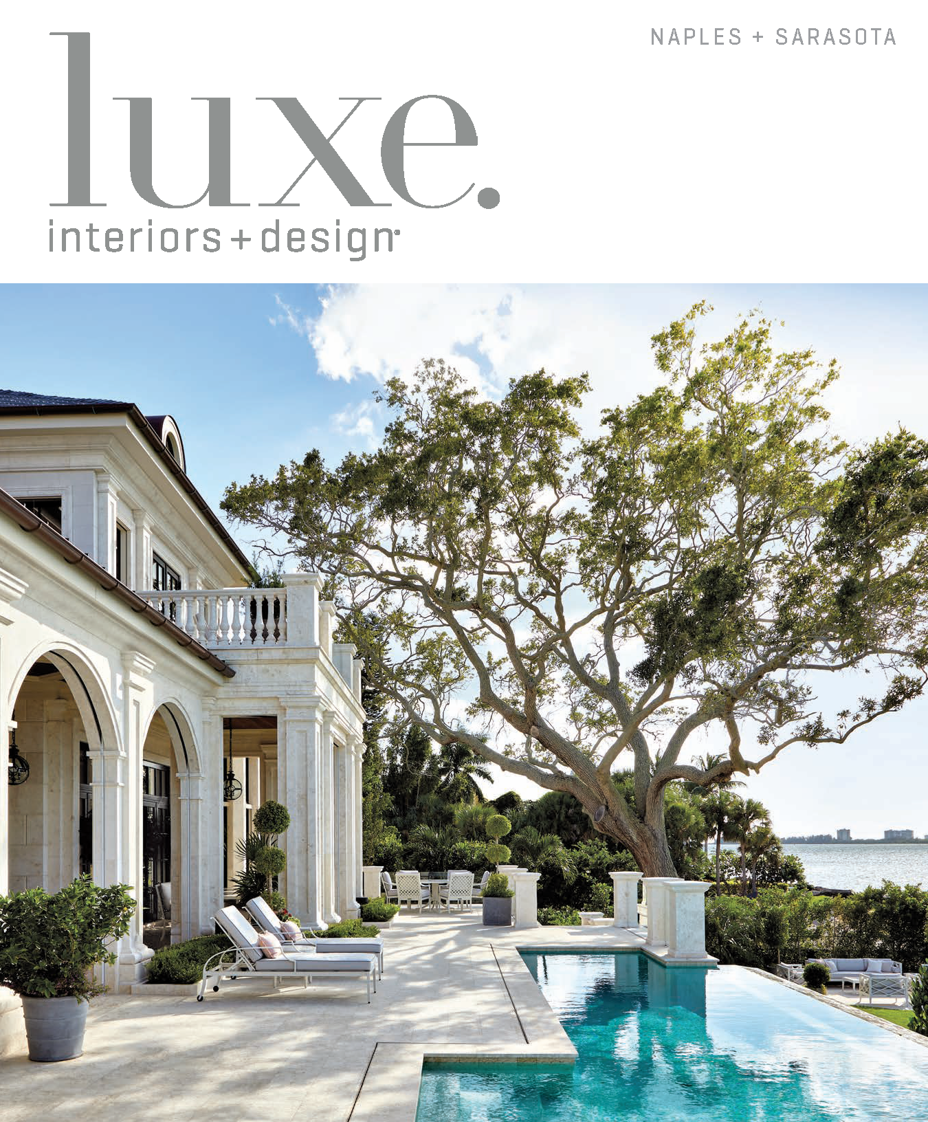
Bridgeview, a Waterfront Home in Harbor Acres, Graces the Cover of LUXE Magazine.
Resting on what many would consider to be Sarasota’s most sought-after waterfront property in Harbor Acres, the Bridgeview is a break from more prevalent coastal design. It has become an instant landmark waterfront home in Harbor Acres. Our clients sought a timeless, European neoclassical feel but wanted a home where they could put their feet up and have a place for their kids to visit. The result is an architectural masterpiece that draws from classical design and marries all of the modern amenities.
“It’s like we’ve been here forever. This house was meant for us.” – owners, the Bridgeview
Building a home can be a uniquely trying experience for even the most unflappable clients. But the owners of a grand new house in Sarasota proved they were more than up to the challenge. Over the course of the 5-year project, they were there for it all—weighing in on everything from the furniture and wallpapers to the flowers that scent the garden. They even took a trip to Italy to design a chandelier for the home.
French Neoclassical Style with Modern Amenities
The property and waterfront home in Harbor Acres on Sarasota Bay had been part of the couple’s empty-nest strategy, and they waited until their kids were grown to develop the site. Their brief to residential designer Jennifer Smith and architect Scott Hutton was crystal clear: an elegant, classically inspired home that would be as authentic as it was livable. “We wanted a European Neoclassical feel,” the wife explains, “but it had to be a place where we could put our feet up and our kids could come and stay.”
Smith and Hutton responded with a French Neoclassical style plan that leans heavily on principles like symmetry, proportion, and balance, but their goal “was to create a home tailored to the client’s needs with all the modern amenities,” Smith says. Taking cues from the couple’s favorite Paris hotel, La Réserve, designer Heather Wells continued the theme, creating a richly layered interior detailed with crystal chandeliers, mirrored pilasters, and a mix of luxurious textures. “Our job as designers is to find the essence and soul of the clients, edit it and bring it to its highest point,” Wells says.
Classical Underpinnings
The desired classical underpinnings are clear from the outset. From the parking court, a limestone walkway leads through fragrant, terraced gardens, where landscape designer Keith Williams incorporated clipped boxwood, date palms, citrus trees, gardenias, and star jasmine. “The wife wanted a manicured, clean-lined, layered garden that was flowering and scented,” he says. But the subtle rise of the garden isn’t just for show. Since the home’s waterfront location makes it vulnerable to storm surges, the first-floor living space had to sit 14 feet above grade. Working with project manager Christopher Deemer of Smith & Hutton and builder Richard Perrone, the architects came up with a solution that was at once elegant and practical— setting the house atop a plinth protects it from water and allowed them to tuck a parking garage beneath.
Past a portico of hand-carved Syrian limestone is the front door, where a stunning view of the bay unfolds. “A strong axis through the house and then out to the water was very important to the clients,” Smith says. Further inside at the core sits a skylit atrium, illuminated at night by the chandelier that the owners designed in Murano, Italy. “The atrium brings light into the core of the residence, which could have been very dark,” Hutton says. “It’s a space that is very dynamic and really offers the best vantage point for the rest of the home.” The floor, inlaid with a large quatrefoil, serves as an amuse-bouche of the limestone, marble, onyx, and black granite found throughout.
A Large and Intimate Space
The clients requested an open plan for the public rooms, so Smith and Hutton created a 50-foot-long grand salon parallel to the loggia. The large space is surprisingly intimate, owing to the layout Wells devised: a central sitting room bookended by a dining area and second sitting area beside a reclaimed French fireplace. A dynamic mix of furnishings spanning modern, transitional and antique gives the space a vibrant ambience, as vintage Baccarat chandeliers and parquet de Versailles-patterned French oak floors sit alongside chairs by Swedish modernist Kerstin Hörlin-Holmquist and a moody painting by Charles White.
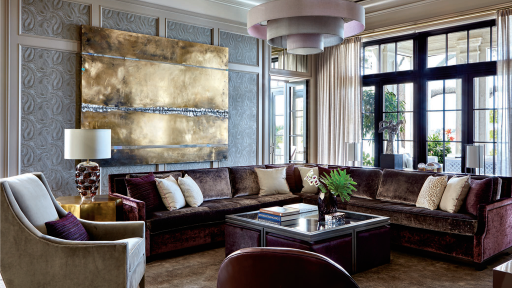
Throughout the Harbor Acres waterfront home, Wells, working with designers Mari Thomas and Kendall Miller, arrayed the rooms in muted hues of ballet-slipper pink, taupe, mocha and plum. The palette deepens in the husband’s office, which was outfitted with fumed oak paneling and a blue-green Venetian plaster ceiling, and brightens in the wife’s office, dressing room and closet, where mirrored cabinetry and shades of blush, silver and mocha lend sparkle. “The colors are so rich and unusual, different from the bright tones you’re used to seeing in Florida,” notes Wells. The end result is a home that feels classic and timeless. “The rooms have a feeling of peace and Zen because of the layers of wallpapers, fabrics, paints and textures,” the wife says. “It’s like we’ve been here forever. This house was meant for us.”

The muted color palette in this waterfront home in Harbor Acres gives rich and unusual tones and textures throughout the house, unlike your typical Florida design.
Read the full article below from LUXE interiors + design, September | October 2020 Edition.
Check out more of our homes by visiting our Homes Gallery.


